
Creating the Brand
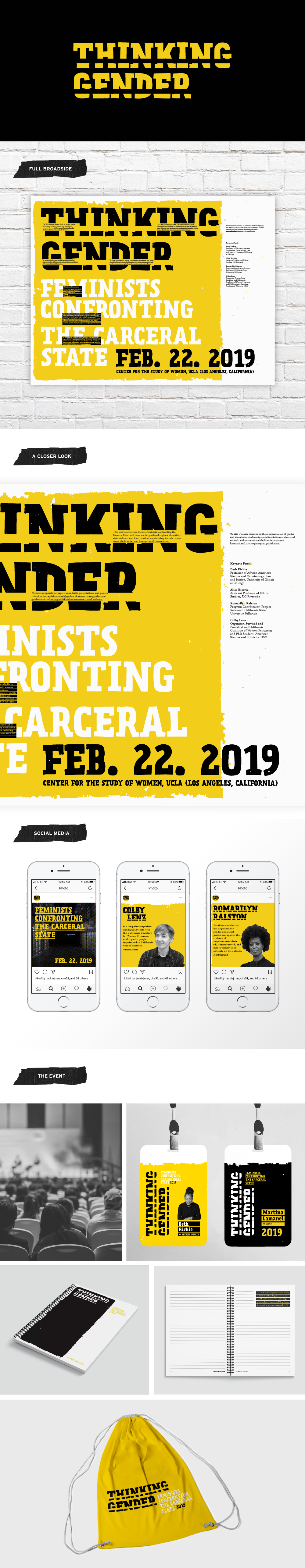
The journey to define the brand for Thinking Gender 2019: Feminists Confronting the Carceral State began with a focus on typography and the artistry it holds. I wanted to convey the complexity of the grassroots movement and the intricate topic being addressed. To achieve this, I used typography to craft a promotional broadside, essentially a poster.
The journey to define the brand for Thinking Gender 2019: Feminists Confronting the Carceral State began with a focus on typography and the artistry it holds. I wanted to convey the complexity of the grassroots movement and the intricate topic being addressed. To achieve this, I used typography to craft a promotional broadside, essentially a poster.
Infusing Depth and Connection
Within this broadside, I aimed to bridge the gap between the theme of the carceral state and letterforms. Through the clever use of lines or bars overlaid on the logotype, a connection between the theme of the topic and the letterforms was created. Additionally, this technique allowed me to overlay the body copy with header text for added impact.
Within this broadside, I aimed to bridge the gap between the theme of the carceral state and letterforms. Through the clever use of lines or bars overlaid on the logotype, a connection between the theme of the topic and the letterforms was created. Additionally, this technique allowed me to overlay the body copy with header text for added impact.
Breaking Preconceived Notions with Color
Knowing that discussions on topics like gender and feminism can be laden with preconceived notions and judgments, a bright and simple color palette was chosen. The goal was to infuse positivity and draw a diverse audience into the conference, brightening the discussion of often harsh realities.
Knowing that discussions on topics like gender and feminism can be laden with preconceived notions and judgments, a bright and simple color palette was chosen. The goal was to infuse positivity and draw a diverse audience into the conference, brightening the discussion of often harsh realities.
Extending the Brand
It didn't stop at the broadside. I applied the concept and style of the conference brand to various materials and applications, including name tags. These name tags maintained consistent texture, type, and color treatments. We also explored how the brand's flexibility could adapt to different information placements while maintaining a cohesive look. Notably, the name tags for guests inverted the colors of keynote speakers' name tags, adding a dynamic touch.
It didn't stop at the broadside. I applied the concept and style of the conference brand to various materials and applications, including name tags. These name tags maintained consistent texture, type, and color treatments. We also explored how the brand's flexibility could adapt to different information placements while maintaining a cohesive look. Notably, the name tags for guests inverted the colors of keynote speakers' name tags, adding a dynamic touch.
Beyond the Event
To ensure the brand lived on beyond the event, I thought about practicality and impact. A backpack and notebook, would not only be useful tools for attendees (especially the university students, the primary audience) but would also create brand ambassadors. While the backpack design remained simple, the notebook expanded upon the style of the guest name tags and elements from the broadside. It provided ample space for note-taking while integrating essential statements and statistics related to the conference's focus throughout its pages. This thoughtful approach ensured the brand's message would continue to resonate long after the event's conclusion.
To ensure the brand lived on beyond the event, I thought about practicality and impact. A backpack and notebook, would not only be useful tools for attendees (especially the university students, the primary audience) but would also create brand ambassadors. While the backpack design remained simple, the notebook expanded upon the style of the guest name tags and elements from the broadside. It provided ample space for note-taking while integrating essential statements and statistics related to the conference's focus throughout its pages. This thoughtful approach ensured the brand's message would continue to resonate long after the event's conclusion.