If you've had the chance to keep up with this journey so far, then you know that this next part is where I've started to explore what the artifacts of the campaign could look like. I go into more detail of what these parts are and how feasible they are to create, while also looking at the value or impact they would have, using the Prioritization Matrix, all included in the slides of my pitch below. To see the presentation with presenters notes, select the settings icon and select 'Open Speakers Notes'.
When thinking about concepts for both the design approaches, I started off, by thinking what the content was going to be about and who it was going to be for. In regards to the content/topics that come up with diversity and inclusion, can often be controversial or are very sensitive.
Overview of My Thoughts Behind Both Design Concepts
For the first approach, I wanted it to be clean, and fresh, yet still carry a serious tone. Since I am focusing on faculty/staff for this awareness campaign, I thought about all the channels through which they might receive their information and the amount of information they get daily. Specifically, through email, I wanted it to stand out from the other monotonous (maybe) text-heavy, semi-bland emails they already get. I went for a semi-primary color scheme, to go with that fresh and light feel I was aiming for. At the same time, I wanted it juxtaposed with a thoughtful tone, which is why I decided that the artifacts would be presented in a monochromatic color scheme. So, they would either all be in blue, green, or orange; allowing the color to give it the content a liveliness, but also keeping it clean and thoughtful. I also tried continuing this feeling with the typeface that was clean but with a slight quirkiness for that exciting aspect.
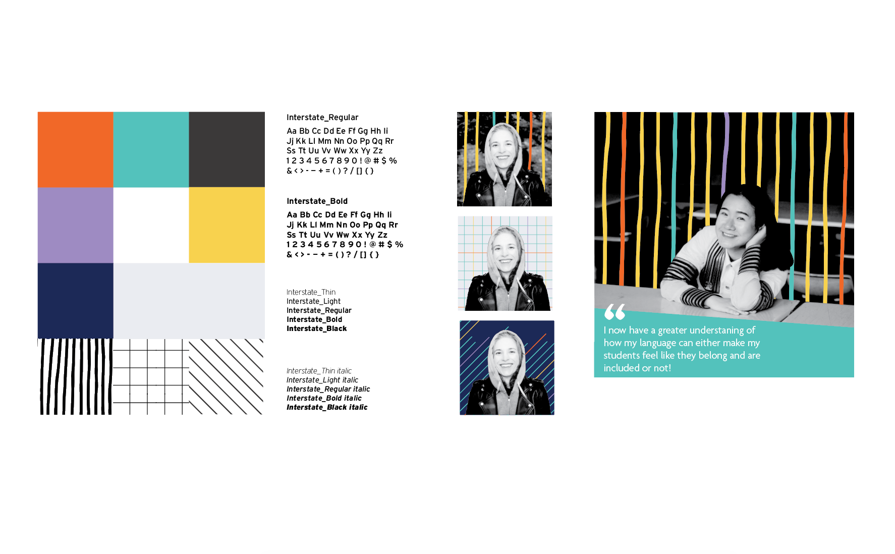
For the second approach, I wanted to push a more lively and playful look to contrast with the more serious tone of the first option. While continuing to think about all the layers and complexity that encompasses diversity I wanted that represented visually with a diverse color scheme and by also introducing texture and shapes with this concept. I wanted this to be something different and fun to look at, something that would get people to stop and take the time to read the content and be enticed and excited by it.
The Feedback I Received After the Pitch
+ The second design concept, with the patterns, feels more like what they want to move forward
+ There are too many words on the testimonial images; ways to condense or simplify this need to be explored
+ The arrangement of the flyer from option one is more successful, need to see this with the design elements of option two
+ The orange doesn't feel right; needs to be explored more
+ There are too many words on the testimonial images; ways to condense or simplify this need to be explored
+ The arrangement of the flyer from option one is more successful, need to see this with the design elements of option two
+ The orange doesn't feel right; needs to be explored more
My Thoughts
It almost seems crazy that (as designers) we torture ourselves through the long hours (sometimes way into the night), trying to come up with a visual language that will encapsulate layers of ideas, concepts, and mindsets for an audience. Yet, in five minutes we have to sell what we've been working on, and soon right after it gets picked apart or decided if it works or not, in less than ten minutes... But I know, that's part of the job that's part of the process. Though the more I think about it the more it makes sense. In the end, everything that we design is first seen and taken in in a moment. People decide to engage in something in seconds, deciding whether they want to welcome it into their lives and become a part of it. So it is important that whatever the design is it speaks to people in as little as a glance.
It almost seems crazy that (as designers) we torture ourselves through the long hours (sometimes way into the night), trying to come up with a visual language that will encapsulate layers of ideas, concepts, and mindsets for an audience. Yet, in five minutes we have to sell what we've been working on, and soon right after it gets picked apart or decided if it works or not, in less than ten minutes... But I know, that's part of the job that's part of the process. Though the more I think about it the more it makes sense. In the end, everything that we design is first seen and taken in in a moment. People decide to engage in something in seconds, deciding whether they want to welcome it into their lives and become a part of it. So it is important that whatever the design is it speaks to people in as little as a glance.